Alt text for charts, graphs and infographics
Alt text for a chart has two parts: a short alt attribute that names the chart and where its details are, and a long description that carries the data as visible text or a table next to the chart. One sentence cannot hold a chart's values. The W3C calls this a two-part text alternative.
Published . Last reviewed .
A bar chart can hold a dozen numbers and a trend. A screen reader user who hears only the word "chart" gets none of it. Charts, graphs, diagrams and maps are what the W3C calls complex images, infographics belong with them, and all of them need more than a short alt. This guide shows how to write both parts of the text alternative, four ways to connect them, and original worked examples, two of them with live charts drawn for this page.
The requirement is WCAG 1.1.1 Non-text Content: a text alternative that serves the equivalent purpose. Its Understanding document includes a data chart example. A short label names the chart, and a longer description identifies the chart type and summarizes the data, trends and implications, with the actual data in a table where that is possible and practical. Our WCAG 1.1.1 explainer covers the criterion, the complete guide to alt text introduces the pattern in a few lines, and the alt text examples show a chart row. This page goes further.
What counts as a complex image
The W3C complex images tutorial describes them as images with substantial information, more than a short phrase or sentence can convey. It names three kinds:
- graphs and charts, including flow charts and organizational charts;
- diagrams and illustrations that the page text relies on you being able to understand;
- maps showing locations or other information, such as weather systems.
Infographics belong here too, because they pack claims, figures and sequence into one picture. A screenshot of a dashboard is the same problem. The test is simple: if what matters fits in one sentence, the image is not complex, and an ordinary short alt is enough.
The two parts of the text alternative
The tutorial asks for a short description and a long description. The short description identifies the image and, where appropriate, says where the long description is. The long description is "a textual representation of the essential information conveyed by the image." WCAG technique G95 uses the same split: its example is a chart with the short alternative "October sales chart" and a long description giving all the information on the chart.
The tutorial's advice on placement is "Make long descriptions available to everyone." Complex images are hard for many people, especially those with low vision, learning disabilities or little subject knowledge, so the long description works best as part of the main content and not as a hidden extra. It is also good practice to refer to the chart from the surrounding text, for example with a sentence that states what the graph shows.
Writing the short alt text
The short alt identifies the chart: its type, its subject and its period, plus where the details are. It does not try to hold the data. The tutorial's own example short description, for a visitor-statistics bar chart, begins "Bar chart showing monthly and total visitors" and then names the period and the sites. WebAIM's rough guide is perhaps a couple of sentences: when the equivalent will not fit in a succinct alt, the rest belongs elsewhere on the page.
| Weak alt text | Better alt text | What changed |
|---|---|---|
alt="chart" | alt="Line chart of median delivery time by month, January to June." | It names the chart type, the measure and the period. |
alt="Image of a graph showing sales" | alt="Bar chart of second quarter sales by region. Data in the table below." | It drops "image of", names the type and says where the data is. |
alt="Orders: website 3,600 then 4,200, mobile app 2,100 then 2,900, wholesale 1,500 then 1,300" | alt="Grouped bar chart of orders by channel, first and second quarter. Data in the table below." | Six values already make a wall of numbers. Real charts have more, and a table keeps each value under its heading. |
alt="Dashboard screenshot" | alt="Analytics dashboard with weekly visits, traffic sources and a conversion funnel. Key figures listed below." | It says what the dashboard shows and points to the text version. |
Writing the long description
A good long description gives a listener what a sighted reader takes from the chart, in this order:
- What it is. The chart type, the subject, the period or scope.
- The scales. What the axes measure and in what units.
- The values. All of them when there are few. When there are many, the range, the highest and lowest, and a table for the rest.
- The trends and relationships. What rises, falls, crosses or stands apart, stated plainly.
- The structure, when it matters. The tutorial notes that the sequence of colors or the relative heights of columns can be relevant to a chart's composition.
- The point of the chart. The takeaway the author put it there to support.
Report what the chart shows and stop there. Phrases such as "as you can see" assume the listener can. A paragraph is the right vehicle for trends. A table is the right vehicle for numbers, with a caption, column headers and row headers, so a screen reader announces the right heading with each value. Our WCAG 1.3.1 explainer covers why that markup matters.
Before: "Orders went up." After: "Total orders rose from 7,200 in the first quarter to 8,400 in the second. Website orders were highest in both quarters. The mobile app grew the most, up 800. Wholesale was the only channel to fall, down 200."
What to lead with for common chart types
The first sentence of a long description should give the point a sighted reader would take in first. What that is depends on the chart. These are our own suggestions, not W3C rules, and the figures are invented.
| Chart type | Lead with | Example opening |
|---|---|---|
| Line chart | The overall direction, then the highest and lowest points and any sharp change. | "Weekly sign-ups rose from 120 in week 1 to 310 in week 12, with one dip to 150 in week 8." |
| Bar chart | The ranking, then the gap between the leader and the rest. | "Of five regions, the north sold the most, at 1,900 units, nearly double the south's 1,000." |
| Pie or donut chart | The shares, largest first, and what they add up to. | "Iced tea made up 45% of drink sales, hot tea 35% and everything else 20%." |
| Scatter plot | The relationship between the two measures, then any outliers. | "Stores with more floor space tended to sell more, apart from two small stores that sold far above the pattern." |
| Stacked bar chart | The totals first, then the largest segment in each bar. | "Support tickets fell each month, from 400 in January to 280 in March. Billing questions were the largest share every month." |
Where the long description goes
The W3C complex images tutorial shows three approaches for descriptions that include structure, and a fourth for plain text. A fifth, the old longdesc attribute, belongs in the past.
| Pattern | How it works | Use it when | Watch out for |
|---|---|---|---|
| Description in the page, location named in the alt | The description is text near the chart, and the alt says where it is, such as "Data in the table below." This is the tutorial's approach 2 and technique G74. | Almost always. Everyone sees the same text. | The location must be clear and accurate. G74 asks that the description sit near the chart, though not necessarily as the very next item. |
| Adjacent link to a description | A text link beside the chart opens the description on another page or section. This is approach 1 and technique G73. | The description is long, or shared by several pages. | The link text must say what it opens. The tutorial notes that all web browsers and assistive technologies support this, but the link is not associated with the image in a semantic way. The figure pattern (approach 3) groups them. |
| Description inside a figcaption | A figure holds the image and a figcaption containing the description, including headings and a table. This is approach 3. | The description needs structure and belongs with the image. | The tutorial's examples add role="group" to the figure for older browsers. ARIA in HTML says a figure that has a figcaption should take no role other than figure, so our examples leave it off. |
aria-describedby | The image points to the id of a paragraph elsewhere on the page. See the tutorial's second example and technique ARIA15. | The description is text only. | The referenced text is read as one continuous paragraph. Headings and tables lose their structure. |
longdesc | An HTML4 attribute pointing to a description page. | Never. | WebAIM calls it deprecated and says it was never well supported in screen readers. |
The figure pattern looks like this. The heading level inside the figcaption should follow the headings around it.
<figure>
  <img src="orders.png"
       alt="Grouped bar chart of orders by channel, described below.">
  <figcaption>
    <h3>Orders by channel: description</h3>
    <p>Total orders rose from 7,200 to 8,400 ...</p>
    <table>
      <caption>Orders by channel</caption>
      <!-- header row, one row per channel -->
    </table>
  </figcaption>
</figure>
One related rule: when a visible caption is present, WebAIM notes that the image still needs its own alt text, and that the alt and the figcaption should not repeat each other.
Worked example 1: a bar chart with a data table
The chart below was drawn for this page. The business and the figures are invented. It uses the simplest pattern: the alt names the chart and points to the table, and the table and a summary carry the data. The caption adds the takeaway and does not repeat the alt. The two live charts on this page use a plain caption line to keep the layout simple; in your own pages, the figure pattern above is the better structure.
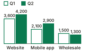
Figure 1. Website orders led in both quarters (illustrative figures).
| Channel | First quarter | Second quarter | Change |
|---|---|---|---|
| Website | 3,600 | 4,200 | Up 600 |
| Mobile app | 2,100 | 2,900 | Up 800 |
| Wholesale | 1,500 | 1,300 | Down 200 |
| Total | 7,200 | 8,400 | Up 1,200 |
Total orders rose from 7,200 in the first quarter to 8,400 in the second. Website orders were highest in both quarters. The mobile app grew the most, up 800 orders. Wholesale was the only channel to fall, down 200.
The markup behind it:
<img src="orders-by-channel.svg"
     alt="Grouped bar chart of Northwind Coffee orders by channel,
          first and second quarter. Data in the table below.">
<p><strong>Figure 1.</strong> Website orders led in both quarters ...</p>
<table>
  <caption>Northwind Coffee orders by channel</caption>
  <thead>
    <tr><th scope="col">Channel</th> ... </tr>
  </thead>
  <tbody>
    <tr><th scope="row">Website</th><td>3,600</td> ... </tr>
  </tbody>
</table>
Worked example 2: a line chart with a text description
A chart with one series and a clear trend can do with a paragraph. Here the description is visible on the page, and the image points to it with aria-describedby, the pattern in the tutorial's second example. The alt stays short because the description is attached to the image programmatically.
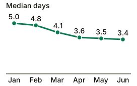
Figure 2. Delivery time fell fastest into March (illustrative figures).
Median delivery time fell from 5.0 days in January to 3.4 days in June. The biggest drop came between February and March, from 4.8 to 4.1 days. From April to June the line was nearly flat, at 3.6, 3.5 and 3.4 days.
<img src="delivery-time.svg"
     alt="Line chart of median delivery time by month, January to June."
     aria-describedby="delivery-desc">
<p id="delivery-desc">Median delivery time fell from 5.0 days ...</p>
This works because the description is plain text. If it needed a table or headings, the structure would be flattened into one paragraph and the figure pattern above would be the better choice.
Flow charts, infographics, maps and SVG
Flow charts and organization charts
The tutorial lists both as complex images. A list carries the structure that a paragraph loses: an ordered list for a process, nested lists for a hierarchy.
<img src="returns-flow.png"
     alt="Flow chart of the returns process. Steps are listed below.">
<ol>
  <li>The customer opens a return request.</li>
  <li>If the order is under 30 days old, the shop emails a prepaid label.</li>
  <li>If it is older, the customer sends a photo of the item first.</li>
  <li>When the parcel arrives, the shop refunds the original payment.</li>
</ol>
Infographics
Treat an infographic as a designed summary of content that also exists as text. Publish every claim, figure and step from the graphic as ordinary page text, in the same words, and let the alt name the infographic and say where that text is. If the graphic holds a fact that appears nowhere else, add it to the page first. The tutorial also suggests reducing unnecessary complexity in the image, which helps everyone.
<img src="phone-case-recycling.png"
     alt="Infographic: how to recycle a phone case in four steps.
          The steps are listed in the text below.">
<h2>How to recycle a phone case</h2>
<ol> ... one list item per step, with the same wording ... </ol>
Maps
A map that shows locations needs the same information as text: names, addresses, opening hours, directions. List the facts a visitor needs next to the map, and have the alt say the list is there. An interactive embedded map is a larger problem, and the essentials still belong in text beside it.
<img src="cafes-map.png"
     alt="Map of the three Northwind Coffee cafes in the city center.
          Addresses and opening hours are listed below.">
<ul>
  <li>Market Street cafe: 12 Market Street, open 7 a.m. to 6 p.m.</li>
  <!-- one item per cafe -->
</ul>
Charts drawn as inline SVG
An inline <svg> chart has no alt attribute. Give it role="img" and a name. In WAI-ARIA 1.2, an element with the img role must be labeled with aria-label or aria-labelledby, and its children are presentational. That second point matters for charts: the drawing's internal structure is presentational, so do not rely on text inside it being announced. Put the data in a table or paragraph outside it. Our alt text examples cover the basics of inline SVG.
<svg role="img" aria-labelledby="chart-title"
     aria-describedby="chart-summary" viewBox="0 0 400 250">
  <title id="chart-title">Grouped bar chart of orders by channel</title>
  <!-- bars and labels -->
</svg>
<p id="chart-summary">Total orders rose from 7,200 to 8,400 ...</p>
Whatever markup you choose, listen to it with a screen reader before you publish. For subjective cases, WebAIM suggests user testing, "with and without a screen reader."
Color, contrast and shape inside the chart
The chart image has its own accessibility needs, separate from the text alternative. WCAG 1.4.1 Use of Color says color cannot be the only visual means of distinguishing a visual element, so give each series a second cue: a label, a pattern or a different shape. WCAG 1.4.11 Non-text Contrast asks for 3:1 against adjacent colors for the parts of a graphic needed to understand it, and its Understanding document gives each line in a graph as an example. See our WCAG 1.4.11 explainer and the color contrast guide.
In Figure 1, the first-quarter bars are outlined and the second-quarter bars are solid, so the two series differ by more than color, and every bar carries its value. The green is more than 5:1 against the white background. If words appear inside a chart image, the image contrast checker measures whether they are readable.
What checkers and AI can and cannot do with a chart
- Rule checks can tell that an image has an alt attribute and that it is not a bare filename. They cannot tell that a chart needs a long description.
- Our alt text checker compares the image with its alt text. A bare "chart" on a chart that plainly carries specific information is the kind of generic label its "too vague" verdict exists for. It sees the image and its alt text only. It does not read the table or paragraph that holds your long description, so it cannot confirm that the numbers there match the chart. Read the table against the chart yourself.
- The alt text generator writes a one-sentence draft aimed at under 125 characters, which suits the short alt. Its page says plainly that one sentence cannot hold a chart's data. Write or check the long description yourself.
- Numbers read by a vision model are unverified. Our accuracy test used product photos and two gradients, not charts, so we have no measurement for how often a model misreads a chart.
Automated checks of any kind cover only part of WCAG; see how much of WCAG automated testing covers. For the wider picture, read how to make a website accessible and, for a chart already published, how to test website accessibility.
Chart alt text questions
How long should alt text for a chart be?
The short alt should be a sentence or two: the chart type, the subject, the period and where the details are. WCAG sets no character limit. The data belongs in a long description on the page, not in the attribute.
Do I need both alt text and a data table?
For a complex chart, yes: the W3C describes a two-part text alternative, a short description and a long one. The WCAG Understanding document says to provide the actual data in a table where that is possible and practical. If the whole chart fits in one sentence, a short alt is enough.
Can I put the whole description in the alt attribute?
Only if it is genuinely short. WebAIM's rough guide is perhaps a couple of sentences, and it puts anything that will not fit in text elsewhere on the page. Alt text is also usually invisible to sighted visitors, who may benefit from a long description too.
Is aria-describedby enough on its own?
It can carry a text-only description. The W3C notes that the referenced text is treated as one continuous paragraph, so headings and tables lose their structure, and it says the approach only works for text-only descriptions. For anything structured, put the description in the page or in a figcaption. Either way, keep the description visible on the page, as in Figure 2, so nobody depends on it being announced.
Should the long description be visible to everyone?
The W3C recommends it: complex images are hard for many people, so the long description should be available to everyone, not only to people using assistive technology. Technique G74 puts the description in the standard presentation near the chart, so no one has to jump elsewhere to find it.
Can AI write alt text for a chart?
It can draft the short alt. Treat any number it reads from the image as unverified, and check the long description against the chart yourself. We have not measured how accurately vision models read charts.
Is your chart alt text more than the word "chart"?
Our free checker downloads up to six images from any page and asks whether each alt text is true of its image. No account, just an email address once, and one check a day.
Check if my alt text is actually rightFind the images missing alt text
The free scan finds missing and placeholder alt text across up to 3 pages of your site, alongside the other rule-based WCAG checks. No signup.
Scan my site for free